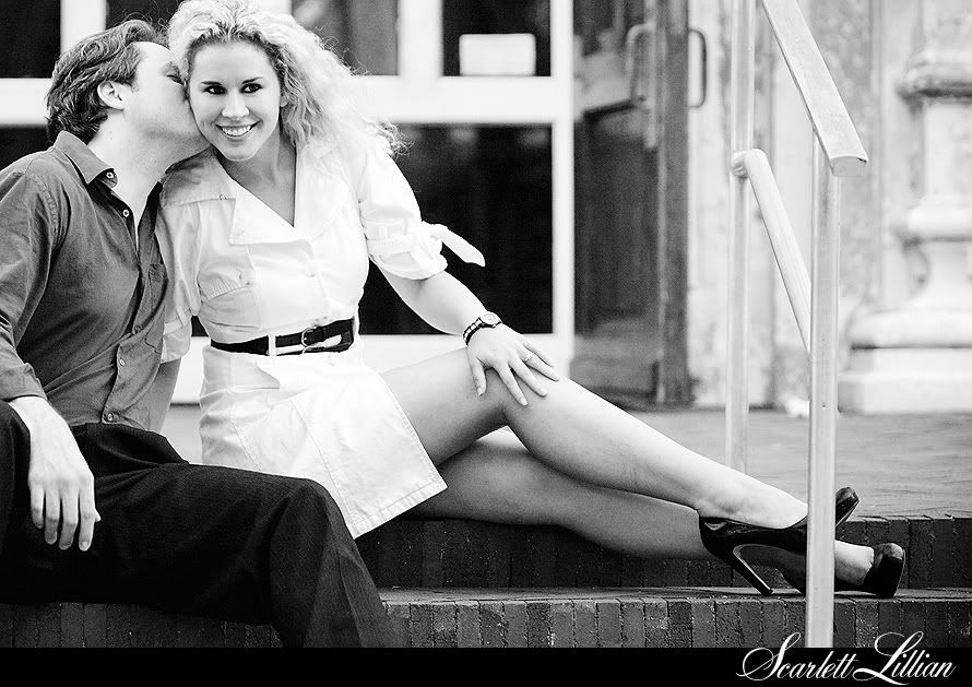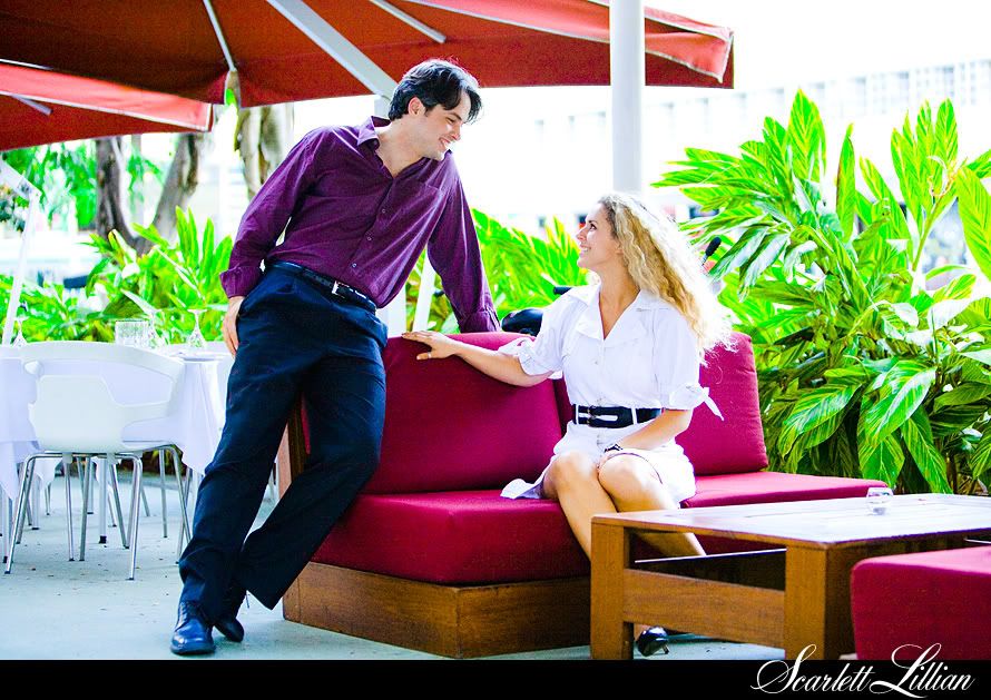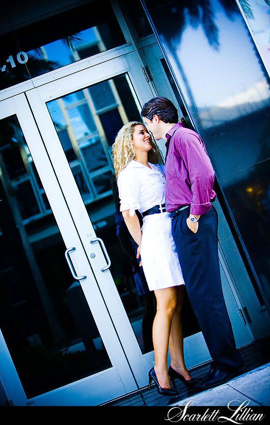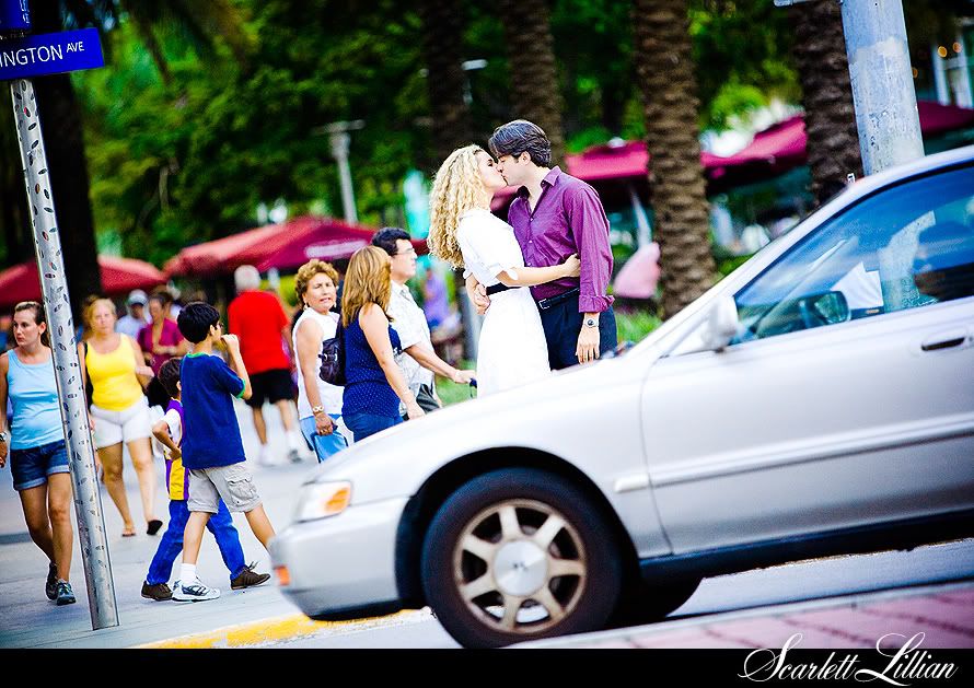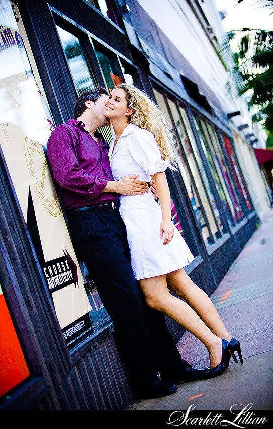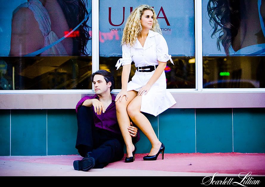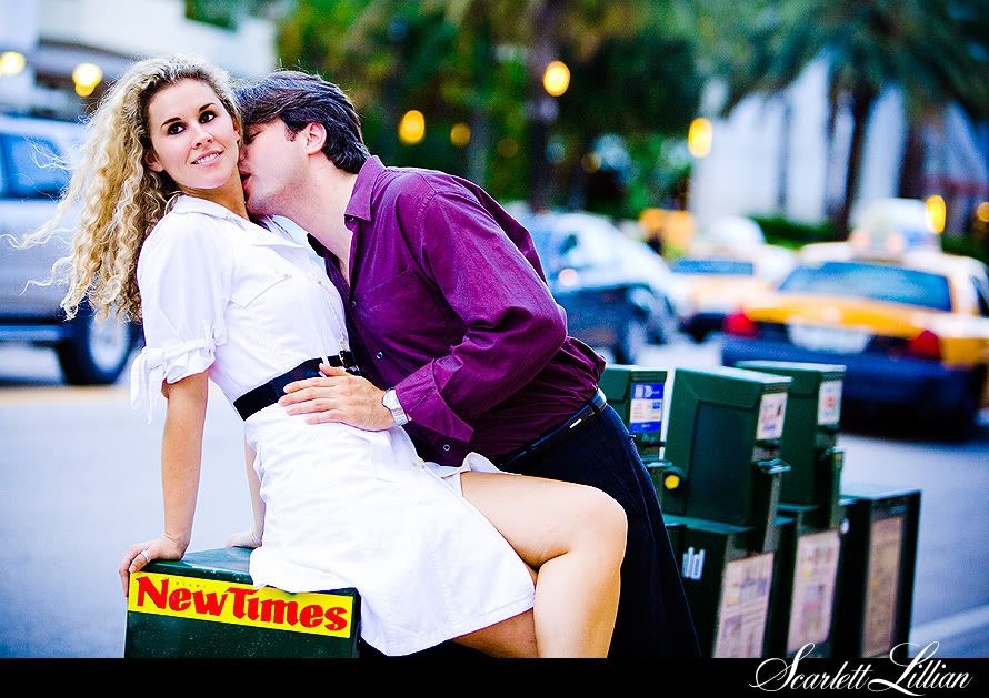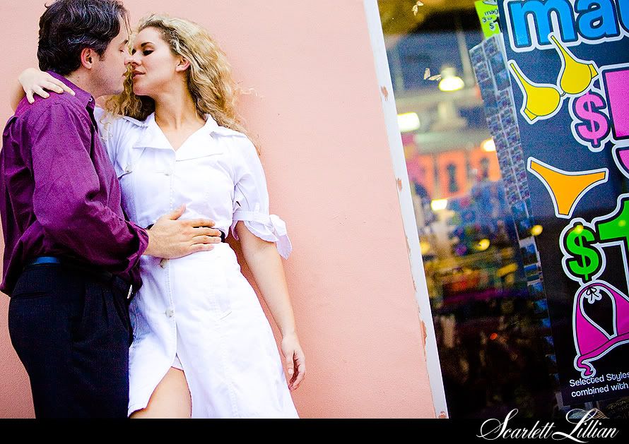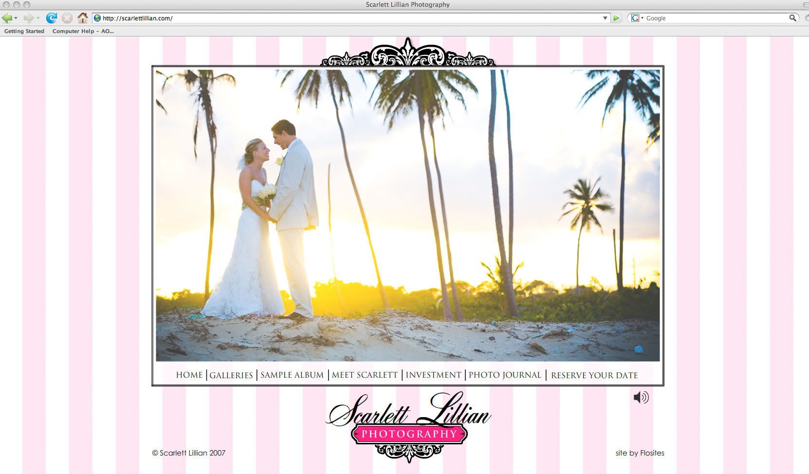
Bye bye pink stripes.
I've gone back to my roots.
Hot pink.
Don't get me wrong, I loved the pink and white stripes that branded my blog the past year that you knew me best for. My dining room is still painted that way. But for my blog, and my website, and my branding, I needed some redecorating. Maybe it's the Creative A.D.D. I always say I have. As soon as I create something I love and get it set just perfectly, I'm ready to move on and change it up and give birth to something new. Any business or marketing book would probably tell me I'm crazy to change my branding only after a year, but I couldn't stand it, I needed a change. God was stirring the visions inside my head and I had to get them out or I would burst!
But I feel like more that this branding change is more of an evolution to better represent my photography style as it too evolves.
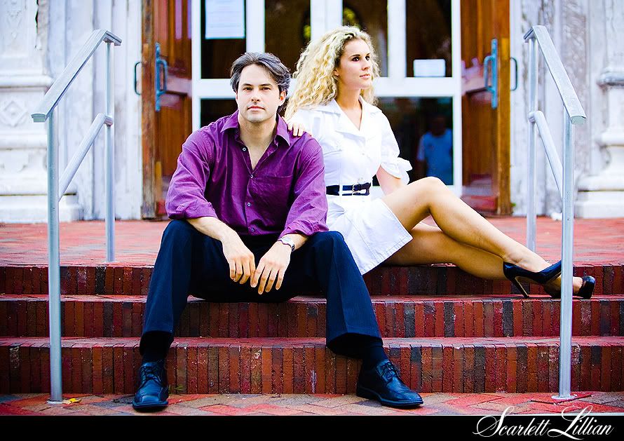
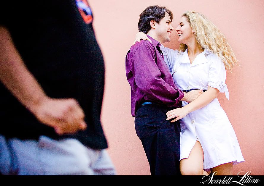
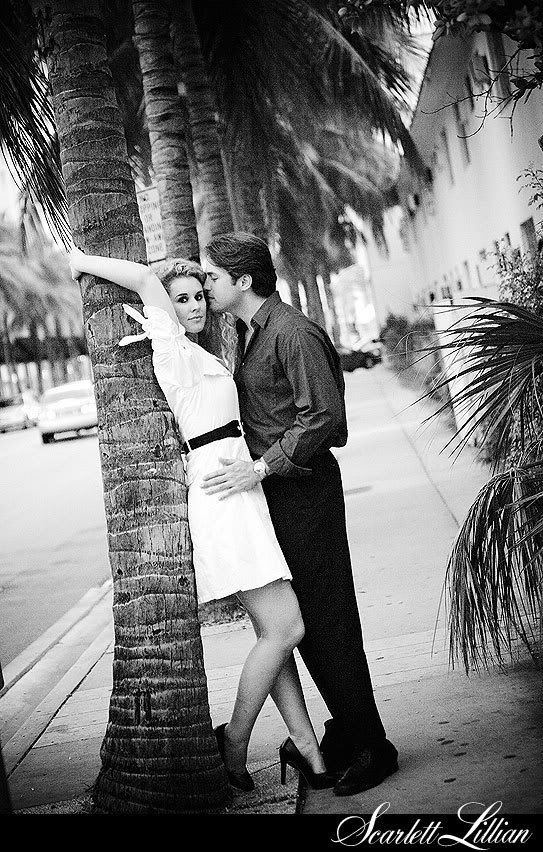
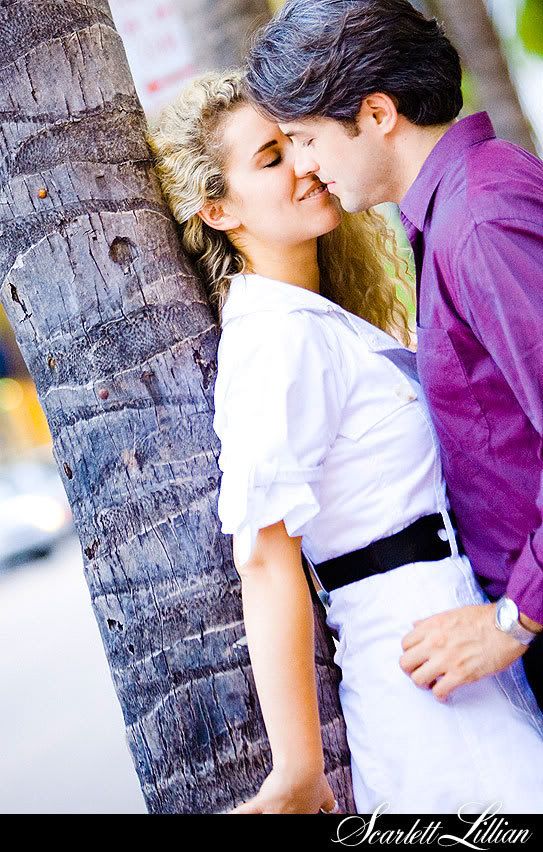
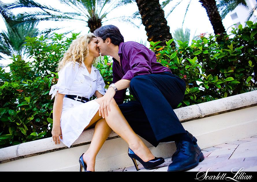
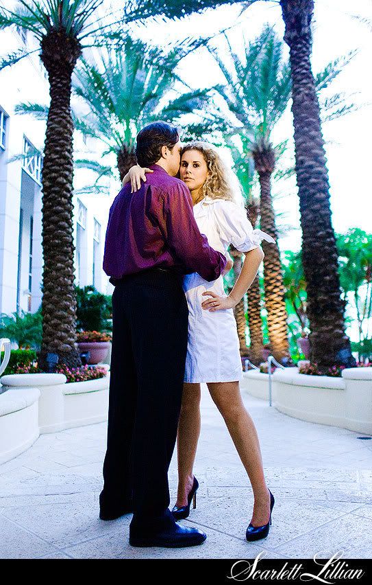
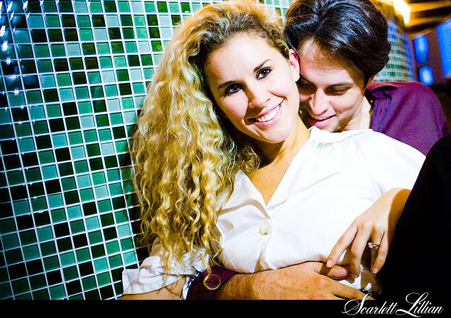
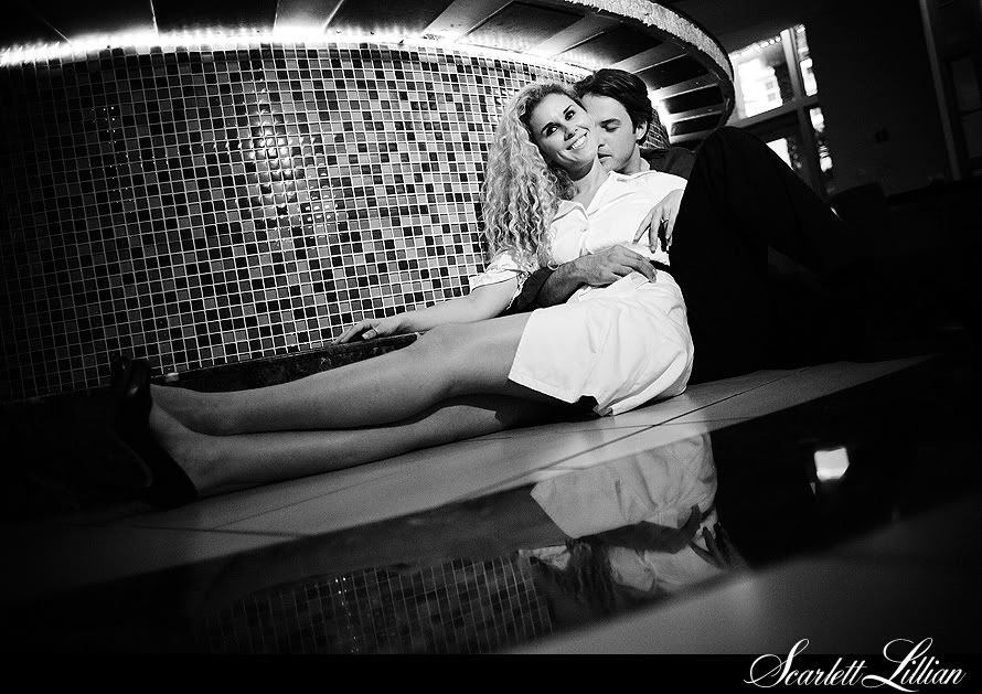
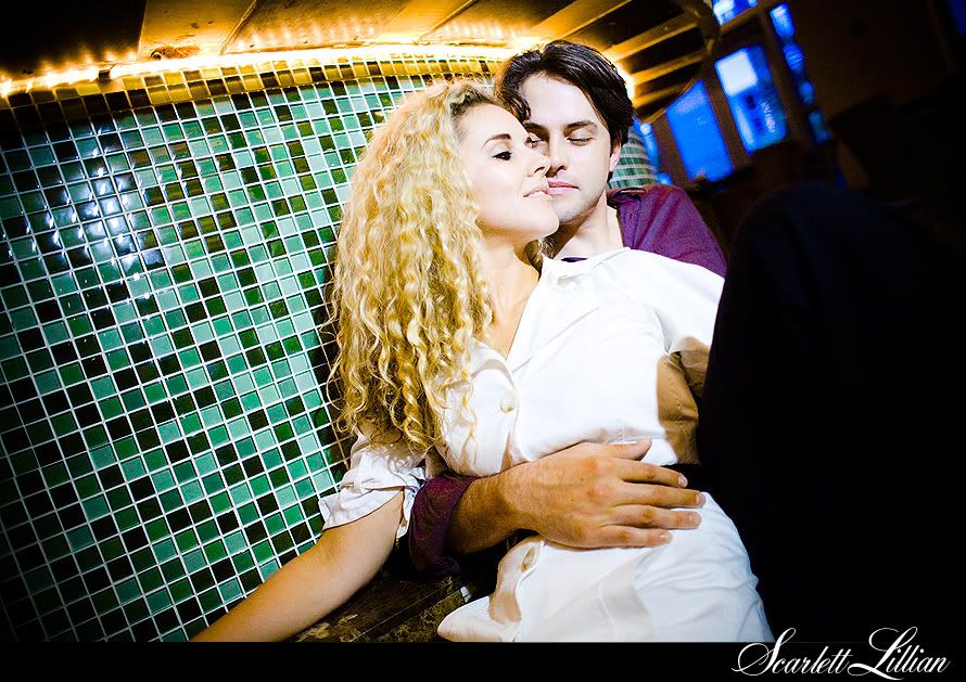
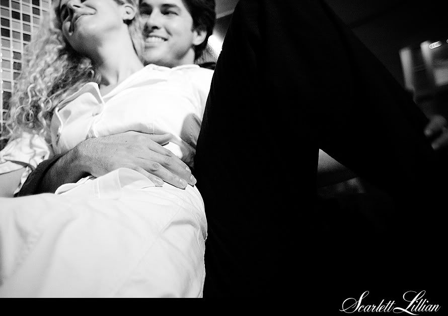
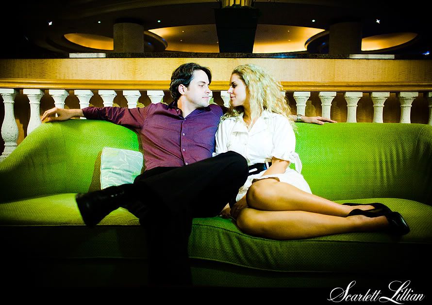
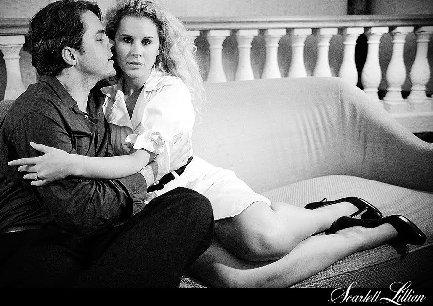
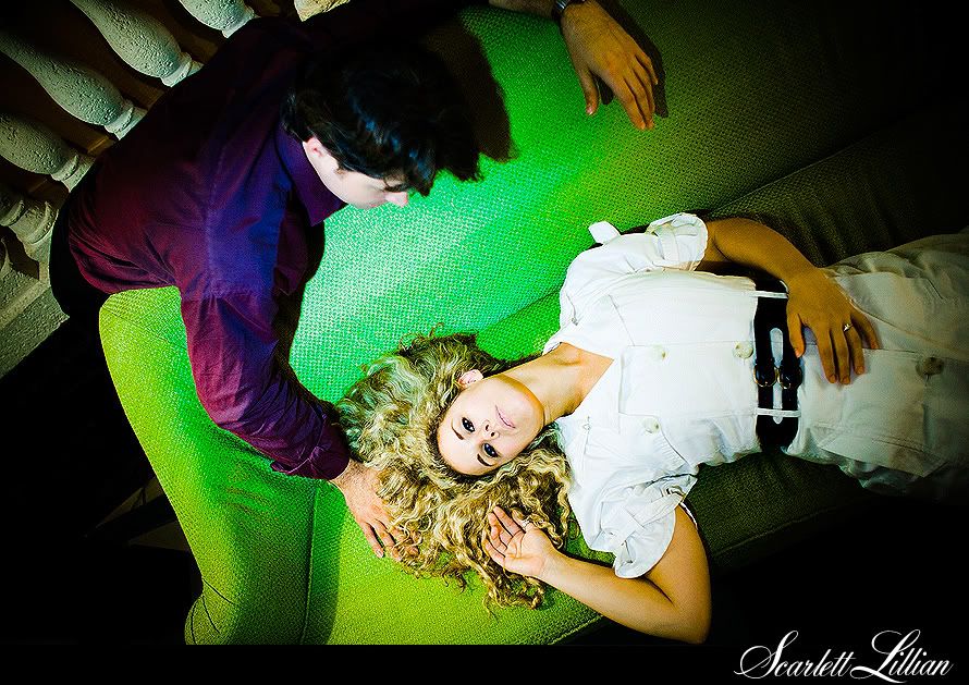
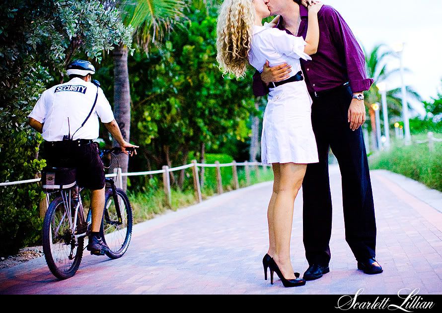
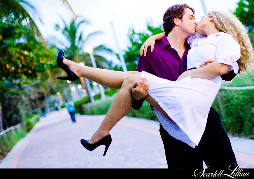
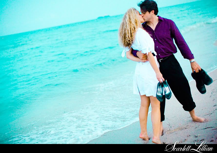
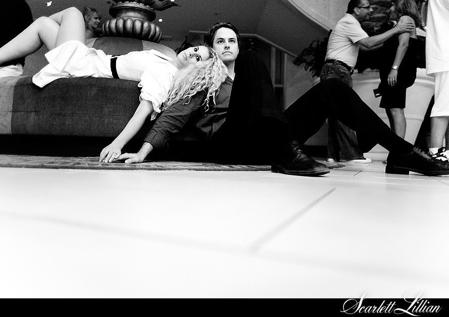
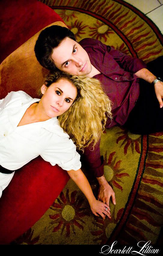
I heard recently through a friend of a friend that a bride didn't hire me for her wedding because she thought my photos were "too risque." My first reaction? "Awesome! Then I'm accomplishing exactly what I want to be through my photography." I WANT my photography to push boundaries. To be daring. To think outside the box. To be bold. Yes, to be "too risque" in that way that 50 years from now you can look back at the photo, still feel the passion in it, and remember why you fell in love with the one still by your side. And I've been so blessed to shoot for brides who "get" that and want the same out of life and for their photos.
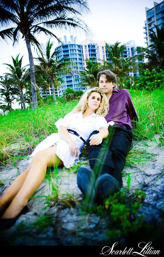
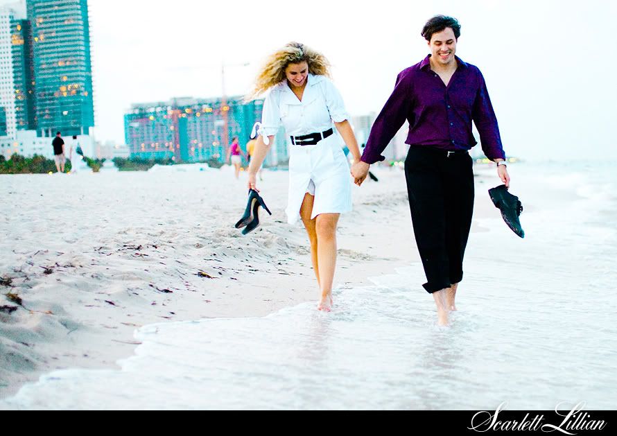
And when I think bold, I think hot pink. It's the color that my first website was when I made the switch from video to photography. It's the color that really best represents how I look at life. Pale pink and white stripes were nice in that Shabby Chic kind of way, but nice is too comfortable. Too normal. Too traditional. Too boring. None of which expresses the heart of my photography and what it has grown to be. Everyone tells me what they love best about my work is how I pop my colors and oversaturate things, so I knew it was time to create a blog that was just as loud.
So here's to a new look!
Also, fellow photog,
Jessica Claire, proposed an interesting question recently asking, why do we as photographers have a website AND a blog when really our blogs are what get updated more frequently and show off our recent and best work? She launched a hot new combined blog-site a little while ago, and I thought it was a genius idea because I never have time to update my website either. Not to mention, according to my stats, my blog is what gets the most love from thousands of you everyday anyways. And it's what not only shows my recent work, it's what shows me, being me, the artist behind the camera and my everyday ramblings about life.

I still love Ross and the team at
Flosites, who designed my old pink and white stripe website shown above, and I continue to highly recommend them, but I've decided to keep things simple for now and ditch my actual website to just focus on the blog.. oh, I mean, photo journal. I did however design a very cool new opening page, so go check it out at
scarlettlillian.com. Otherwise, scarlettlillian.net still remains the homepage for this photo journal! And one cool new feature, everytime you visit this site, or refresh the page, it will display a new favorite photo of mine in the header!
I also have a lot of NEW things to share with you coming up that I'm working on behind the scenes. Ahhhhh, I'm about to burst, it's soooooo killing me not being able to spill the goods yet, but I'm still putting finishing touches on it all in between shooting and editing and now finally finishing the design of this new blog (yes, the ex-graphic designer in me did it myself! Whew... I'm officially burnt out on HTML for a while)...
.......so staaaaaaaaaaay tuned!!!
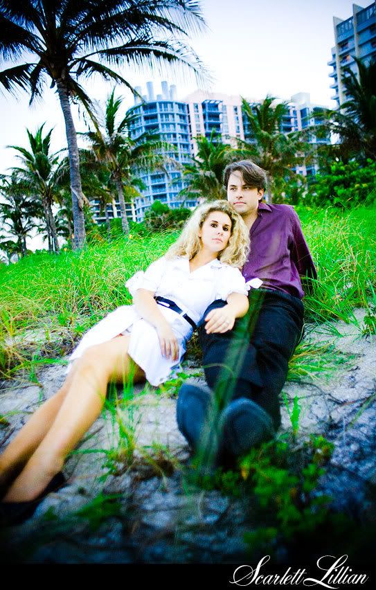
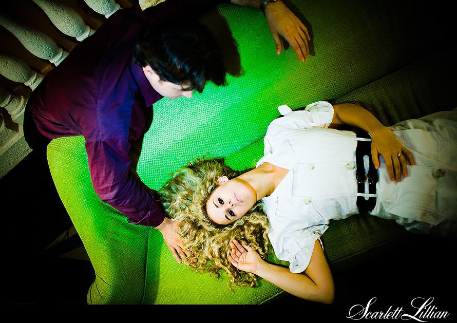
And definitely check back tomorrow because I will be publishing the rest of Alexis and Gerard's steamy Miami engagement session!


